ON DRAWING ICONS
Pierre has an entirely new icon library today after months of design and development work. I’ve spent an inordinate amount of time on this over the last few months—sweating the details of each icon, refining the system, and improving the build system as I went. Now it’s time to show it all off, starting with designing the icons, then building their React components, and the fun detours along the way.
One could argue this is a revenge redesign after Cursor icon-mogged us all. Their post showed how product icon libraries need to evolve with their products, and that getting there often takes a complete redraw to create a more cohesive, beautiful library. Really well done and great work across the board. The nerve of these jerks.
Obviously, this has nothing to do with revenge and everything to do with craft. Redrawing these icons also meant we could revisit how they’re processed, packaged, and consumed in our React apps. Bottom up, a pixel redesign and an overhaul of the code behind it all.
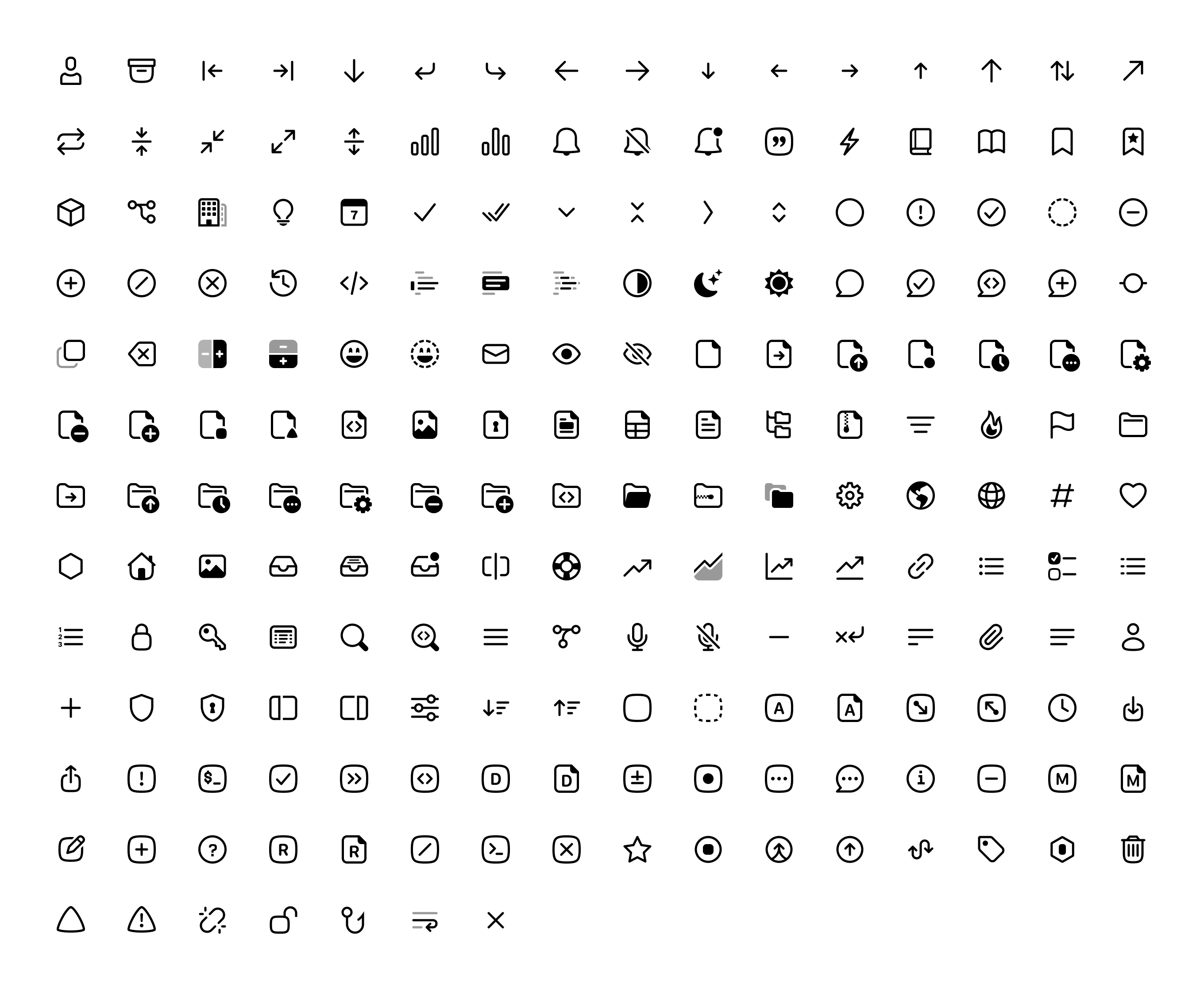
The result is over 1,200 new icons across three sizes and up to three variants. All available in Figma, SVG, and React.
Let’s see how we got there.
HOW WE GOT HERE
FIRST ICONS
Let me take you way back to 2022 when we were first starting to build Pierre. This small batch of wildly inconsistent icons were some of the earliest icons I drew for Pierre. Other than settling in on some basic shapes for work states and Git status—circles for work, squircles for Git—there wasn’t much else keeping these together.
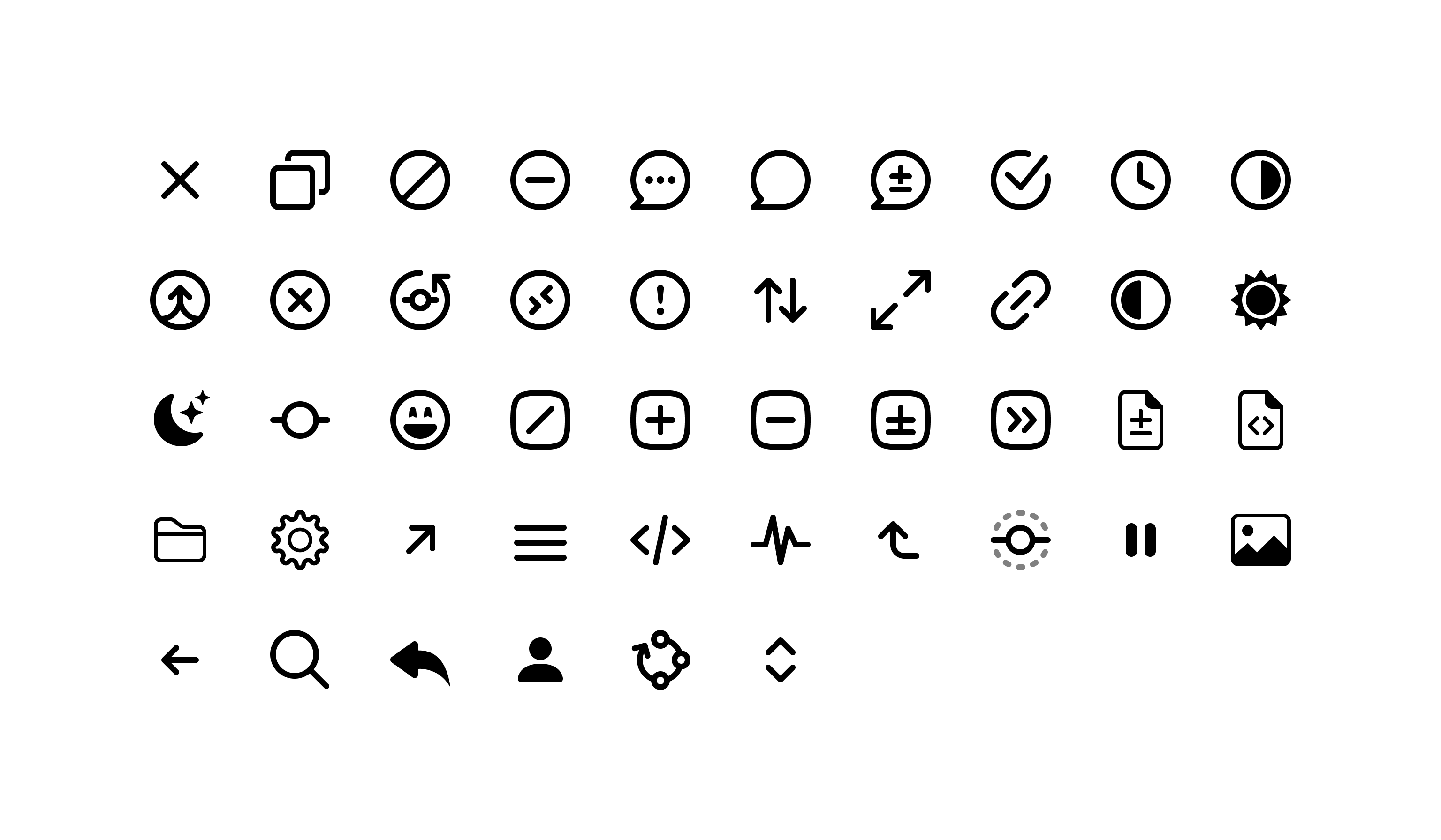
From the jump, they had mismatched stroke widths, viewBox dimensions, and lots of just general composition inconsistencies and errors. Some I never used as well because they were just… bad.
The state and status icons were the most consistent with one another, which makes sense in hindsight because that was where we were putting the most time and energy into the product at that point. Here’s a little reminder of what that looked like.
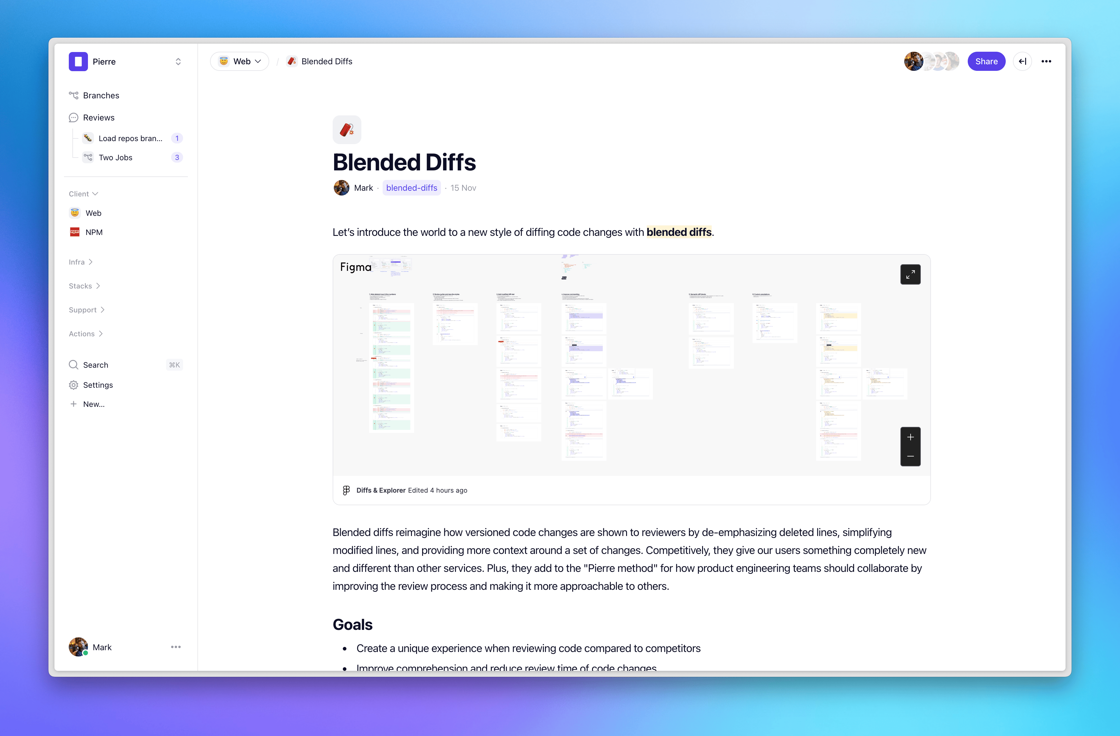
Fast-forwarding to 2025, we had just done a massive overhaul of the product, adding GitHub sync, a new interface, simplified flows, and exploring an agentic homepage centered around insights, productivity, and code review.
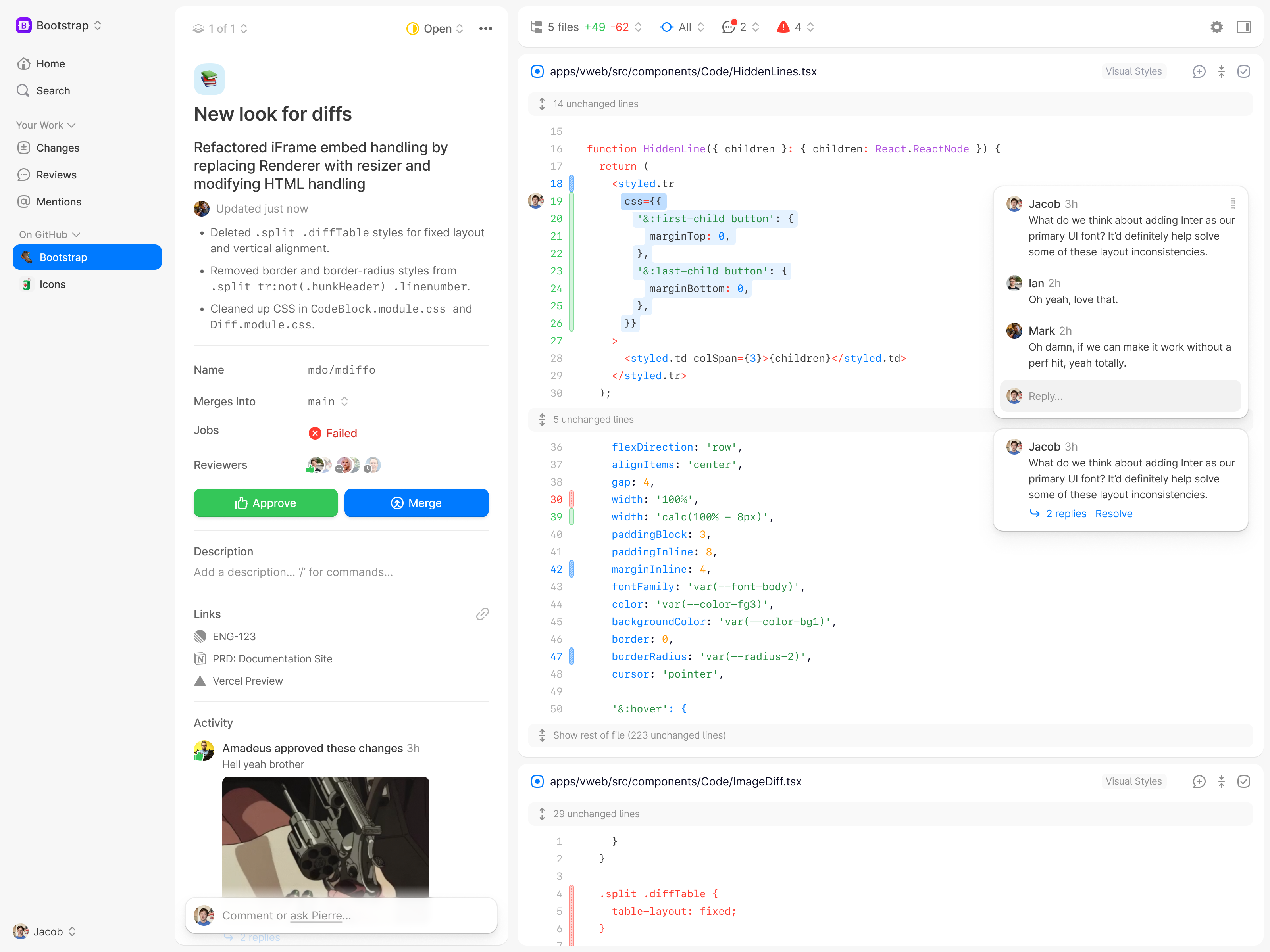
The icon set had expanded—some quite literally (looking at you, wide house)—and they had become even more important to the interface. All over the place, icons were showing up in new sizes, colors, and components. One of my absolute favorites was the small, filled icon overlays and the avatar stacks for Reviewers. It felt so right.
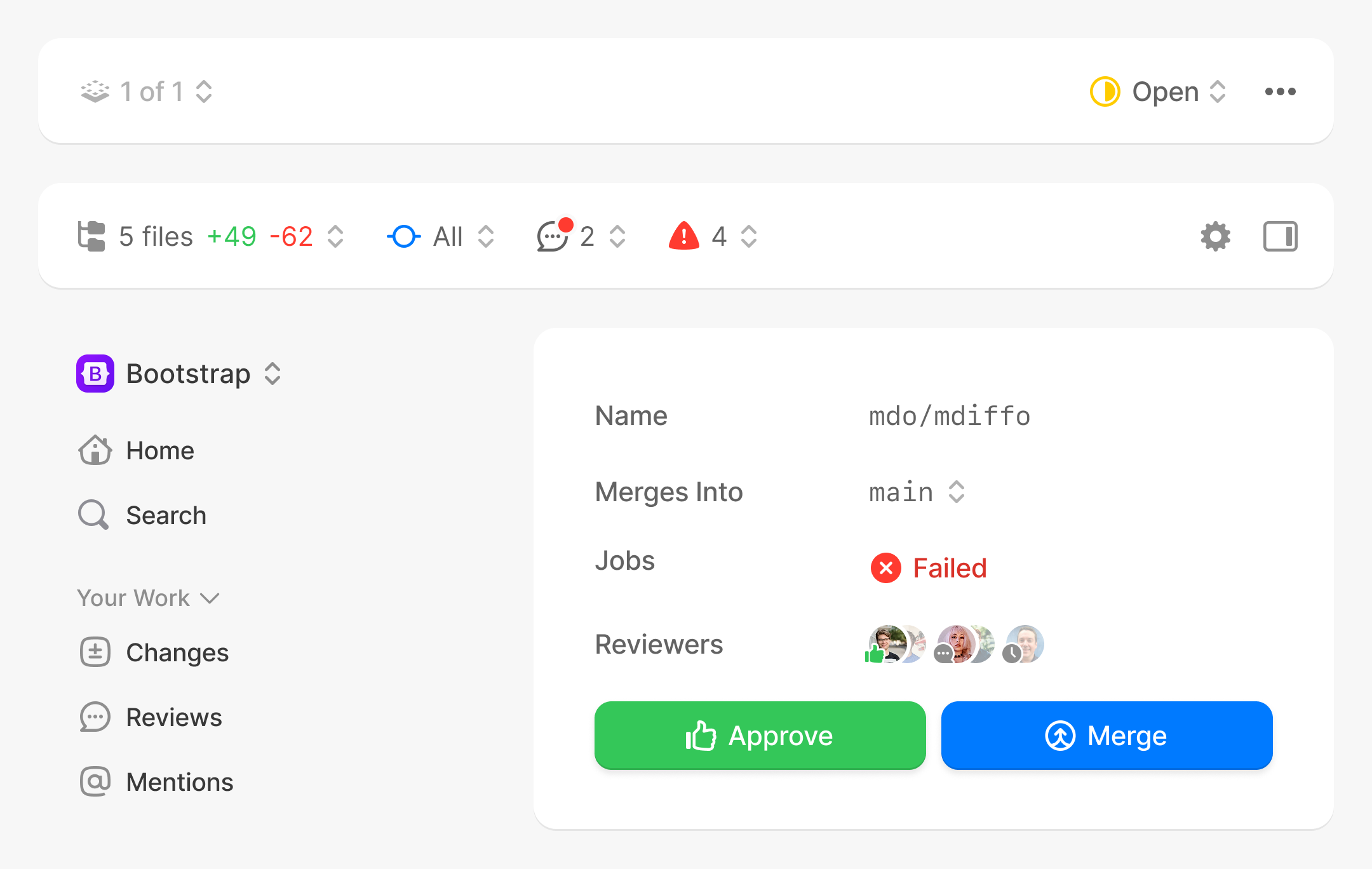
And finally, we arrive in 2026, where the old Pierre product is no more and we have Code Storage and open source projects like Diffs, Trees, and more. Our products had completely changed, but our icons hadn’t kept up.
PIERRE ICONS V1
Here’s where we started with the previous Pierre icon library. Just under 400 icons, each with a mix of styles, but almost all with a 1.5px stroke width.
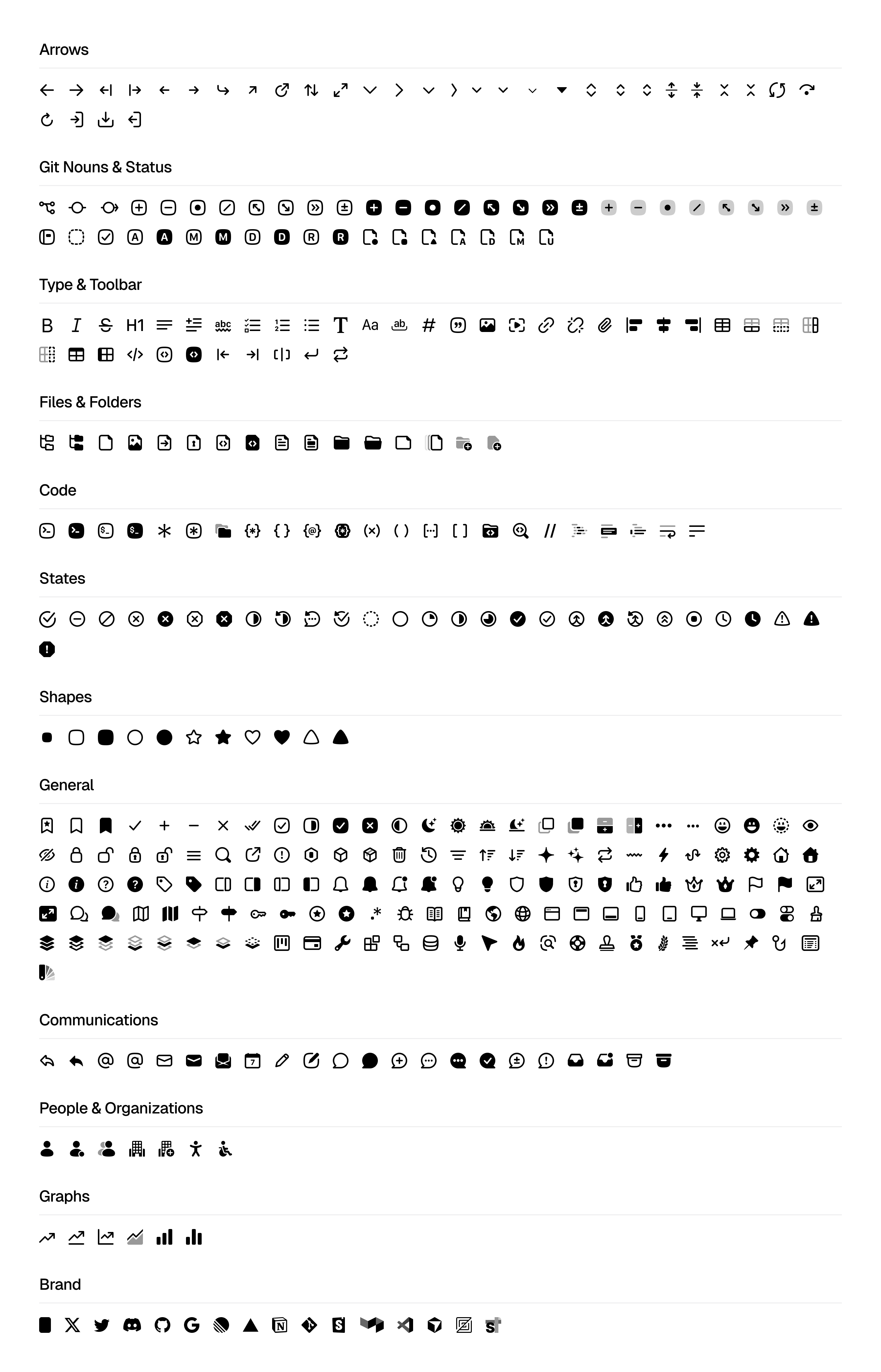
Right off the bat, you might notice:
- We have a lot of arrows and chevrons. It feels like I’m never happy with their size, stroke, or viewBox across projects.
- There are so many icons that are unused since we sunset Pierre.co, so plenty of opportunity to trim the fat. Icons for rich text editing, issue linking from Linear, various devices, and more.
- Some icons are duplicated with different names.
- Several icons had custom viewBox dimensions, usually 18×16px for landscape shapes like sidebar toggle icons or 8×16px for narrow chevrons.
- We each had some icons that we individually hated. Jacob never liked my gear icon, I hated the folding map icon, and goodness do we all have feels on sparkle icons now.
We also have another smaller icon library for the Pierre VS Code icon theme. We use these icons in our Trees project and those are largely full of brand-specific icons for languages, standards, and projects.
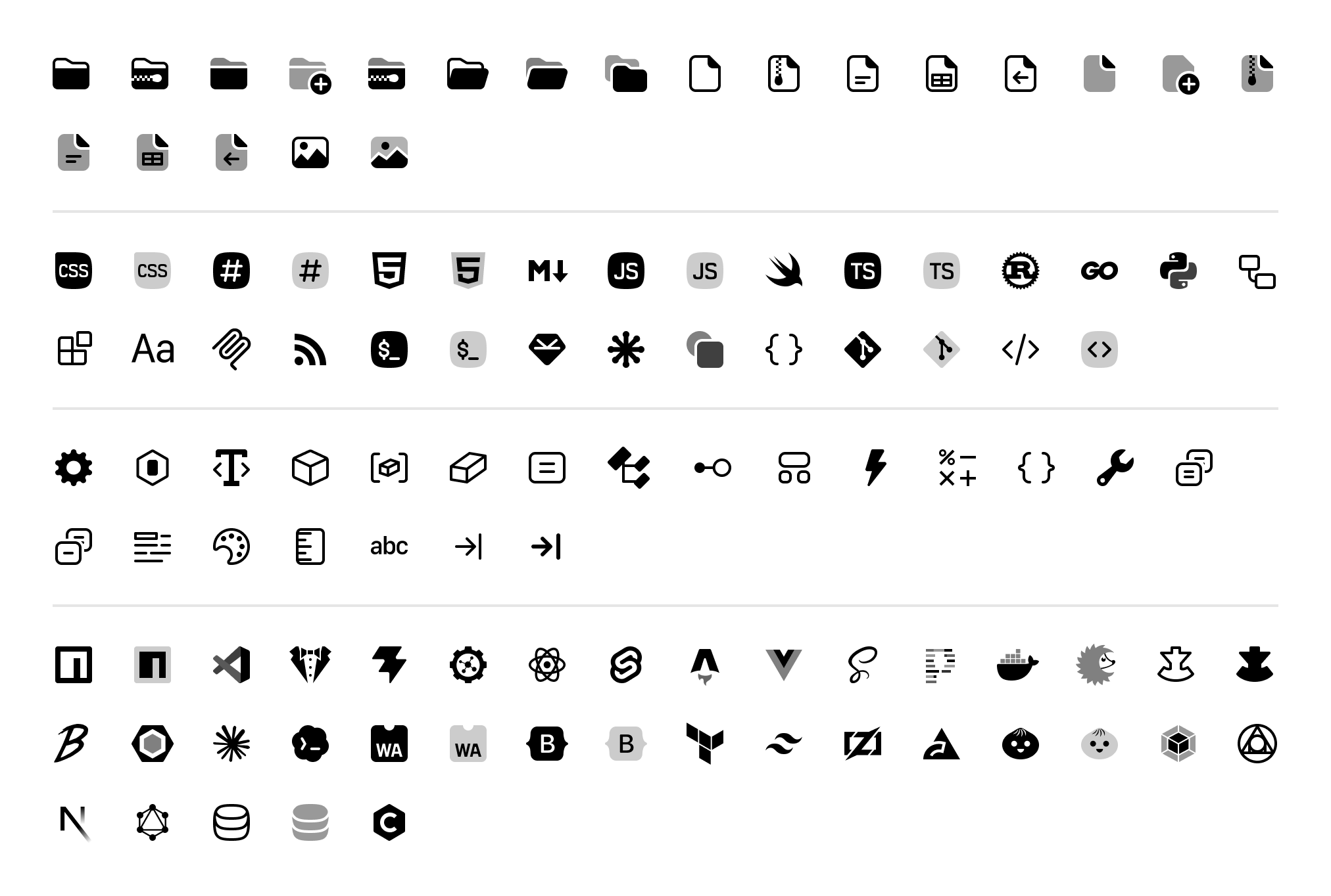
Cleaning those up wasn’t directly part of this process, but I had these icons in mind while drawing the new Duo variants for some icons. I’ll be able to speed run a refresh here when we’re ready for it.
OUR ICON WORKFLOW
The existing workflow is simple: design in Figma, export as SVGs, then process with npm scripts to optimize and convert to React components.
- Draw the icons in Figma on a 16×16px grid.
- Export the icons as SVGs using Figma’s native export.
- Ingest source SVGs by directory via npm script.
- Optimize and clean up SVGs with SVGO to remove Figma-specific noise, flatten groups, strip fixed colors, and more.
- Use SVGR to convert the now improved SVGs into typed React components with shared props for customizing.
This is all done with a single npm run icons:beta command, which cleans up
the existing folder and then rebuilds every icon fresh.
NEW GOALS
My first pass at design goals mixed specs, API ideas, and workflow experiments into one big wish list:
- Redraw every icon at 12, 16, and 24 pixels.
- Introduce a dedicated stroke width for each icon size.
- Define consistent stroke widths, corner radii, and recurring shapes.
- Remove obsolete icons and unnecessary variants.
- Make outline, fill, and duotone feel like one family.
- Compose related icons from reusable component layers in Figma.
- Ensure icon layers stay as non-destructive as possible. (Mostly this meant avoiding flat outlining and leaving more boolean compound vectors).
- Expose those layers in React components so foregrounds and backgrounds can be styled independently.
- And, possibly, skip the local build scripts and export React components directly from Figma.
The initial React API I had in mind was one component per conceptual family, with visual style, size, and state represented by props. I wanted to see if it made sense to build icons the same way in Figma and React.
For families such as files, comments, and status containers, this API was extremely
appealing to me. IconFile could be the parent shape, while text, code, lock,
image, and other glyphs were interchangeable layers. A file with a clock badge might
become <IconFile badge="clock" /> rather than a separate
IconFileBadgeClock.
THREE SIZES
Icon design is for masochists it turns out. Apparently, I just couldn’t wait to draw the same icon three different ways. While time-consuming, it felt necessary given the math of our original 1.5px stroke, especially as you scale down or up to different sizes.
| Size | Scaled stroke |
|---|---|
| 12×12 | 1.125px |
| 16×16 | 1.5px |
| 24×24 | 2.25px |
Fractional values aren’t automatically bad, but scaling affects the optical weight, spacing, corner treatment, and the relationship between a small glyph and its container. A 12px icon often needs fewer details—simpler lines, less rounding, slightly different shapes—while a 24px icon could have more details.
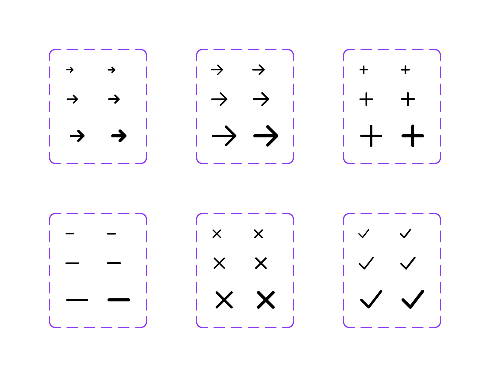
After lots of testing, I settled on default stroke tokens of 1px, 1.25px, and 2px for 12, 16, and 24. Filled variants of (most) line-based symbols would step up to 1.25px, 1.5px, and 2.5px. Finer details within those icons would size down a stroke width (e.g., 1.5px instead of 2px on a 24px icon). Storing those values as Figma variables made it possible to change an entire size while evaluating the system instead of editing hundreds of vectors repeatedly. Though I did do that far too many times as I played around with various values.
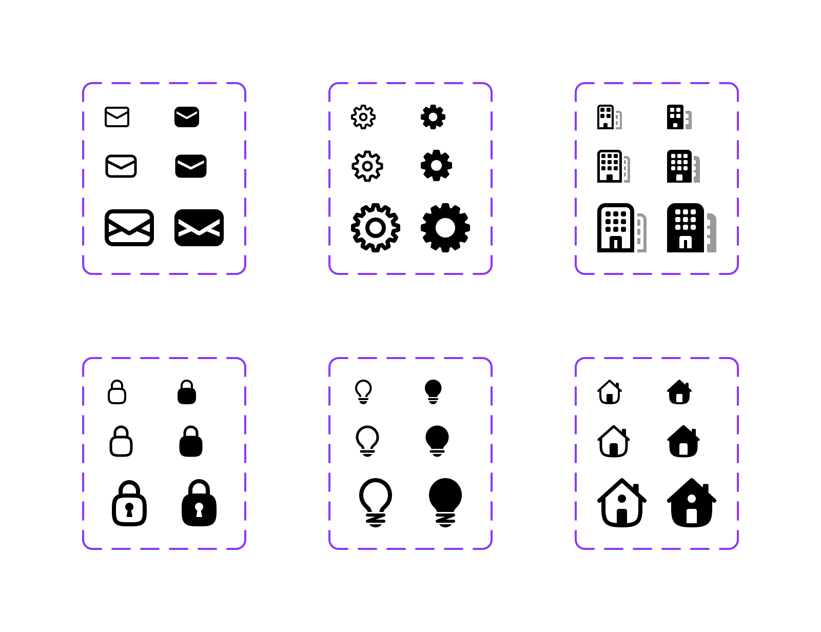
Designing for three different sizes though allowed for some fun opportunities to add those additional details at the larger 24px size. Despite the heavier stroke, we could still show a lot more that could benefit the larger instances for these icons. Think empty states, onboarding flows, marketing sites, and more. In practice, that means an envelope can have more lines, buildings get more windows and a bar between the doors, gears get more teeth (to mess with Jacob), and locks get a keyhole.
BUILDING IN FIGMA
Once you start building out an icon family, you quickly end up repeating pieces of those icons across dozens of similar icons. For example, File becomes FilePlus, FileMinus, FileImage, and so on. I didn’t want the extra overhead of having to manually edit every single icon just because I tweaked the base File icon shape.
Managing all those pieces meant getting creative with first how they are drawn and organized, and then further optimizing the workflows for creating and updating icons in a more automated fashion.
So I started down a path (hah) of drawing these new icons in Figma with a series of interconnected components each featuring multiple variants. Those components include what I call icon layers, icon masks, and base shapes.
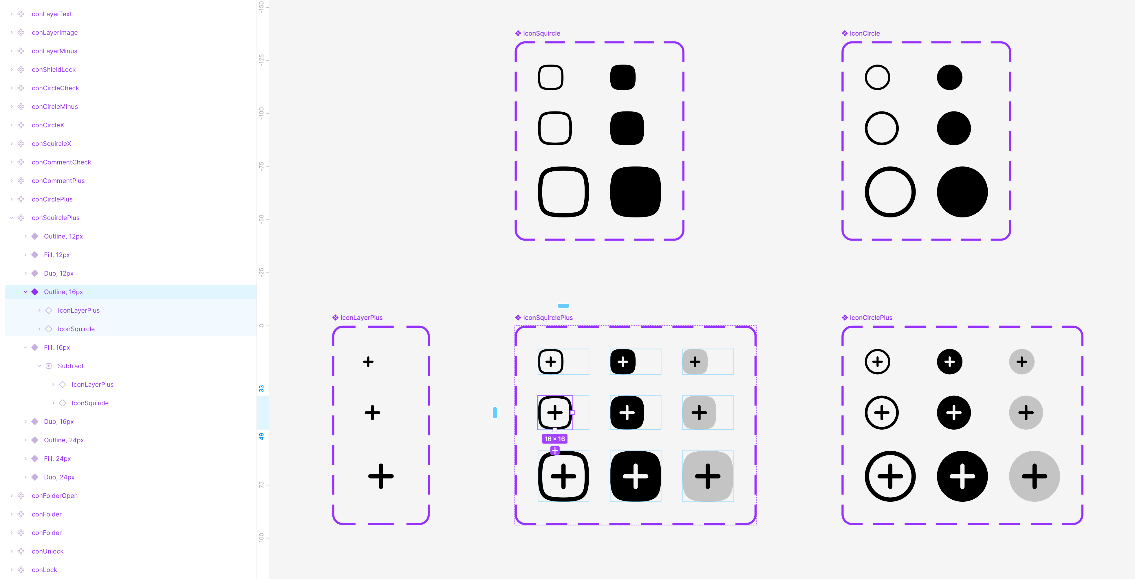
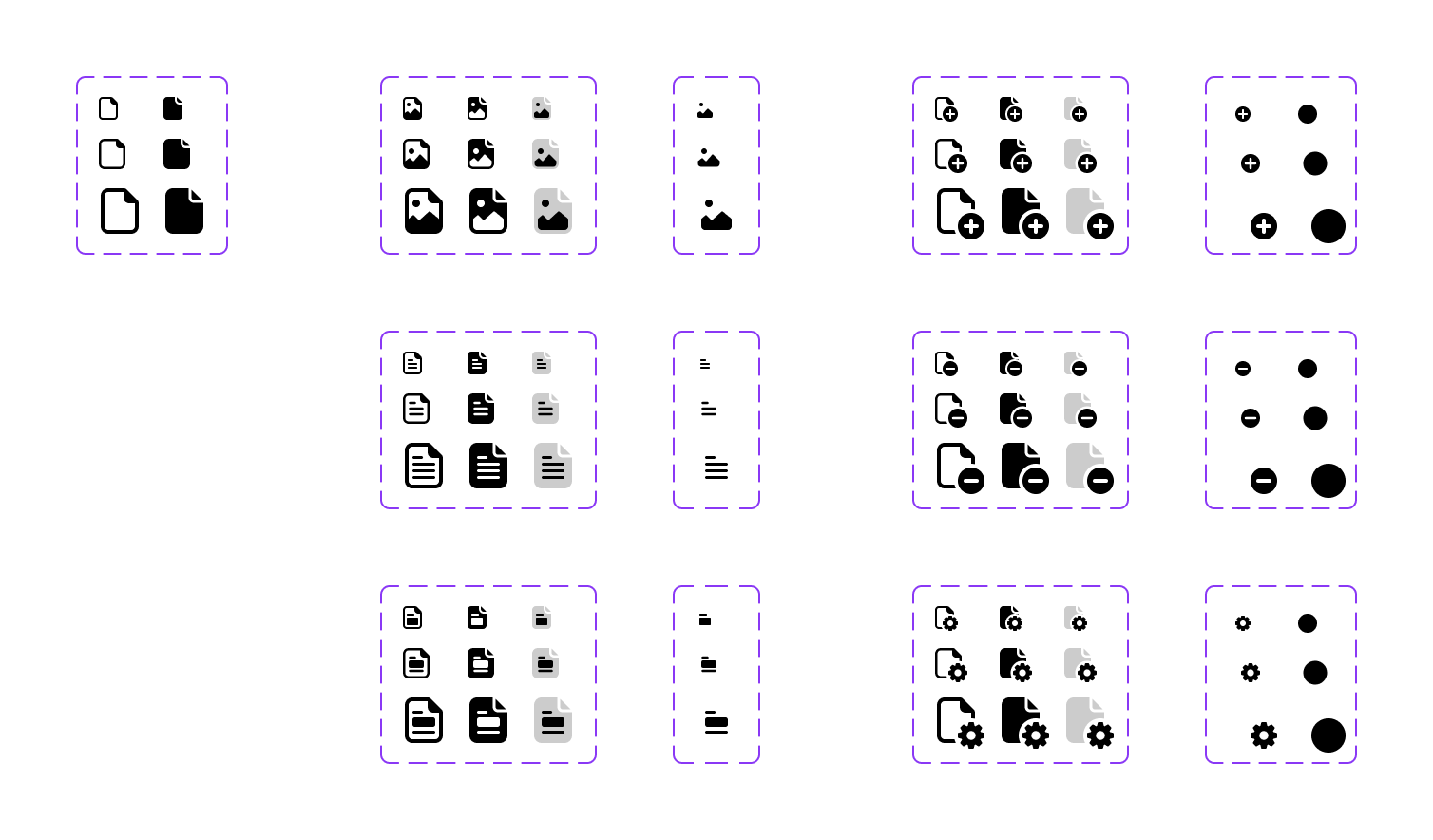
The icon layers and masks function as reusable component sets for the pieces that appear inside other icons:
- File and folder glyphs such as text, code, image, and lock.
- Container symbols such as plus, minus, check, and x.
- Slashes, unread dots, and other overlays.
- Mask shapes that remove enough of a base icon for an overlay or badge to stay legible.
These extra components complicate things in some ways, but ultimately resolve a key issue
of having to manually update up to dozens of icons when making one small change to say our
plus badge or folder shape. Since Figma allows for non-destructive boolean groups (
unions, subtractions, etc), adjusting one shared component shape like
IconFile means automatic updates for 20 other icons.
At 16px, those components fit together like this:
IconFileImage · 16px
├─ Outline
│  └─ Union
│     ├─ IconFile · Outline
│     └─ IconLayerImage
├─ Fill
│  └─ Subtract
│     ├─ IconFile · Fill
│     └─ IconLayerImage
└─ Duo
   ├─ IconFile · Fill
   └─ IconLayerImage

IconLayerImage · 16px
└─ Outline
   ├─ Subtract
   │  ├─ Vector 621
   │  └─ IconFile
   └─ Ellipse 523
IconFileBadgeGear · 16px
├─ Outline
│ └─ Union
│ ├─ Subtract
│ │ ├─ IconFile · Outline
│ │ └─ IconMaskGear · Mask
│ └─ IconMaskGear · Top
├─ Fill
│ ├─ Subtract
│ │ ├─ IconFile · Fill
│ │ └─ IconMaskGear · Mask
│ └─ IconMaskGear · Top
└─ Duo
├─ Subtract
│ ├─ IconFile · Fill
│ └─ IconMaskGear · Mask
└─ IconMaskGear · Top
IconMaskGear · 16px
├─ Top
│ └─ Subtract
│ ├─ Vector
│ └─ Ellipse 535
└─ Mask
└─ Ellipse 531The benefits compound quickly for these related icons—squircle, circle, comment, file, and folder combine to account for 65 other components each with nine variants and three sizes for almost 600 individual icons.
Now, to help manage all these icon families, I wanted an easier way to swap multiple variants of one icon for another. That meant vibe coding some support plugins just for me.
LAYER SWAP
Layer Swap was the first plugin I made specifically for this redraw. Select one or more icon component sets, choose a nested component layer, and replace it everywhere. The plugin matches variants by their properties, so a 12px outline glyph is replaced by the replacement’s 12px outline glyph rather than whichever component Figma considers the default.
For example, if I already have IconSquirclePlus with two layers,
IconSquircle and IconLayerPlus, I just want to duplicate the
component and replace the plus with say a minus. Normally that means copy-pasting or
replacing an instance and dealing with mismatched properties, sizes, etc. Not any more.
It also rotates and flips a nested layer across every variant. Pointing an arrow in another direction becomes one operation instead of six or nine, with the transformation applied around the layer’s own center.
SHAPE LANGUAGE OVERLAY
I defined a first pass at the general shape language for the new icons early on, but rarely found myself checking in on it through the design process. Toggling little red overlays on everything was tedious, and I didn’t want to add yet another component layer that sat around in each icon.
I vibe-coded a Shape Language Overlay plugin to register local shape components, match them to icon variants by size, and place them in a locked sibling frame. The overlay can then be refreshed as the icon moves and cleared without modifying the component that will be exported.
I didn’t use it much though because I can usually keep these shape requirements in my head, and the sibling frames ended up polluting my workspace more than I liked.
TAPER STROKE
I took another detour down a more difficult path problem with tapered strokes, primarily in the arrow icons. Three equal-width strokes meeting at a single point create more painted area than any one of those strokes has on its own, so the intersecting point looks optically heavier even when the path is technically perfect.
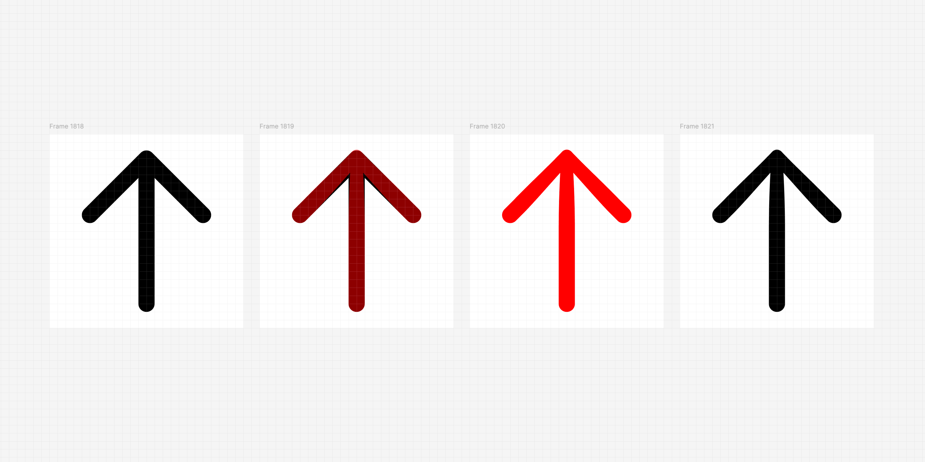
This type of optical correction originates from type design, but can help in icons, too.
Type designers have long thinned strokes where they converge in letters like
M, W, and V. You’d think we shouldn’t need this in
2026, but a retina display only makes the edge smoother. It doesn’t remove the extra
visual mass at the junction. At any of our icons sizes, multiple anti-aliased strokes
still collapse into a dense cluster. And to top it off, white icons on dark backgrounds
can bloom even more.
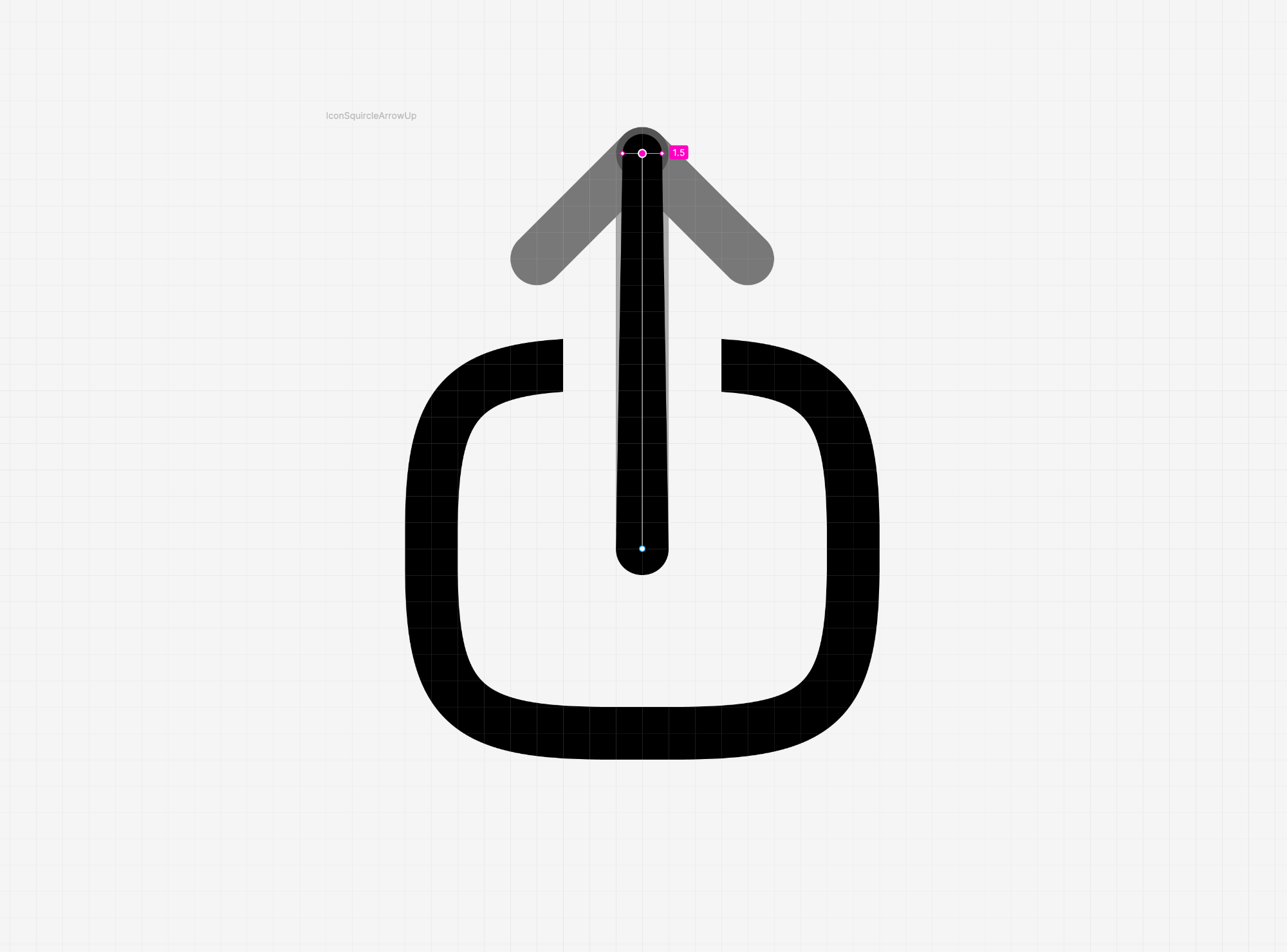
Figma now has a native variable width tool for paths (shown above), but it can’t apply them to a combined vector like these arrows, and it doesn’t seem to work on a single side of the path. Both problems make it a no-go for us.
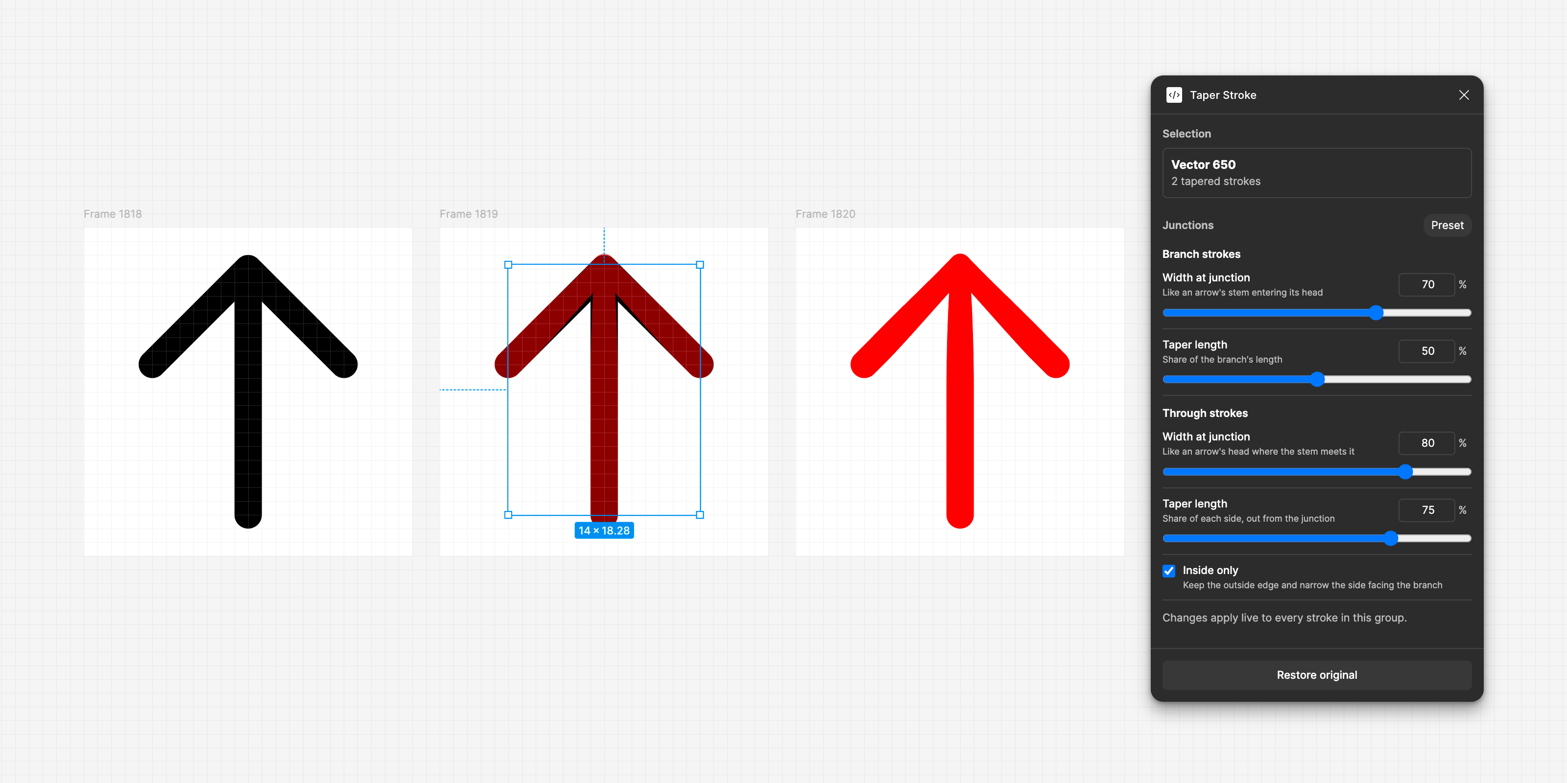
So I vibe-coded another custom plugin called Taper Stroke that closes the vector gap in Figma. It splits the network into editable native strokes, identifies the stem and crown, and (rather importantly) narrows them into the junction while keeping the outside silhouette intact.
While I got to a good place with the plugin and the results were pretty good, I wasn’t 100% sure how best to bring it into my workflow. Ultimately I didn’t want to rush it, so the first beta of the new release won’t be using tapered strokes. I’m hoping to add it in a follow-up release.
ICON PREVIEW GRID
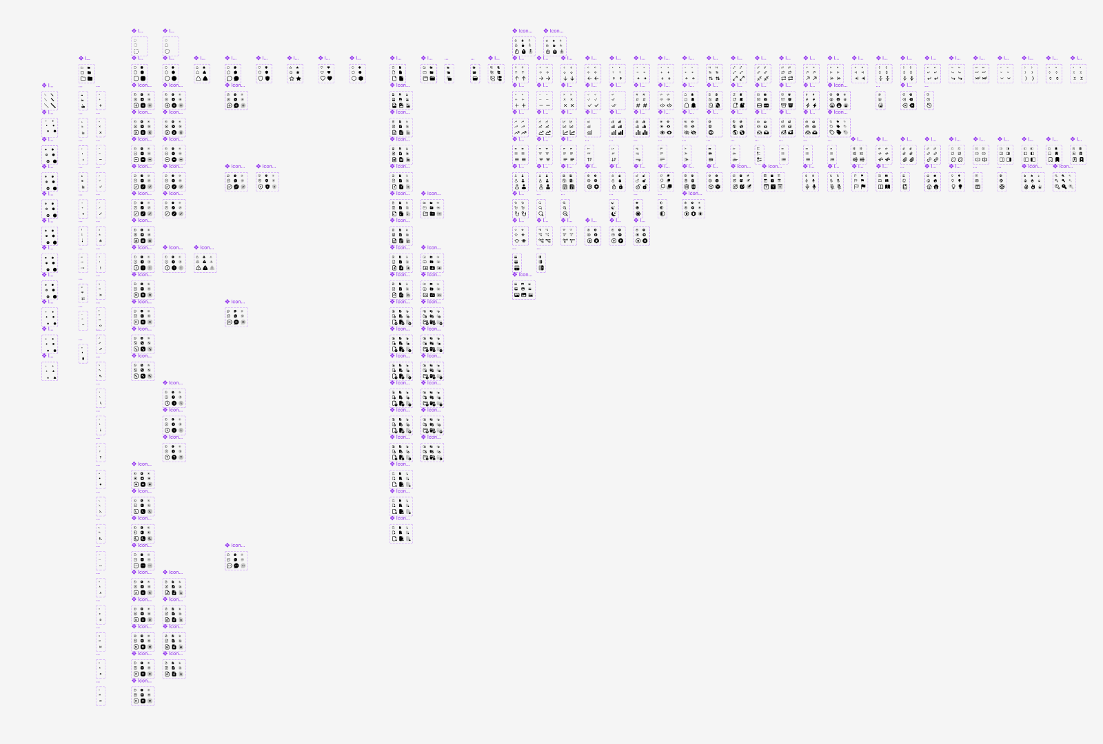
In writing this blog post, I also realized I wanted several images of the the icons—some subset of them, plus a view of all of them in both grid and list views. So I used Figma’s new AI tools to generate a plugin for building those, making it super easy to build supporting images for this post.
Select all the icons, pop open the plugin, configure, and go. Here I generated a grid of the outline, fill, and duo icons all separately.
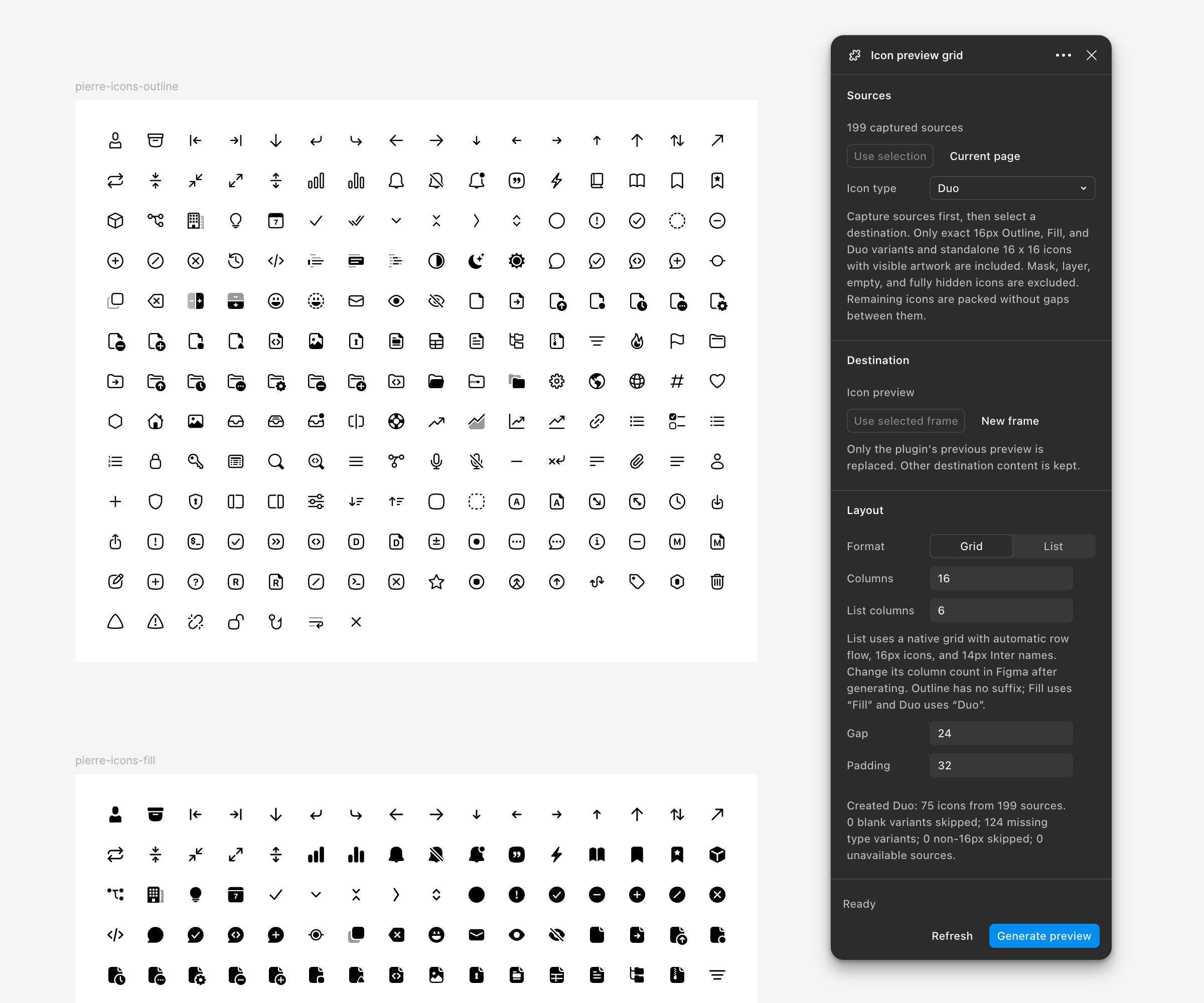
It also generated this list view of all the icons:
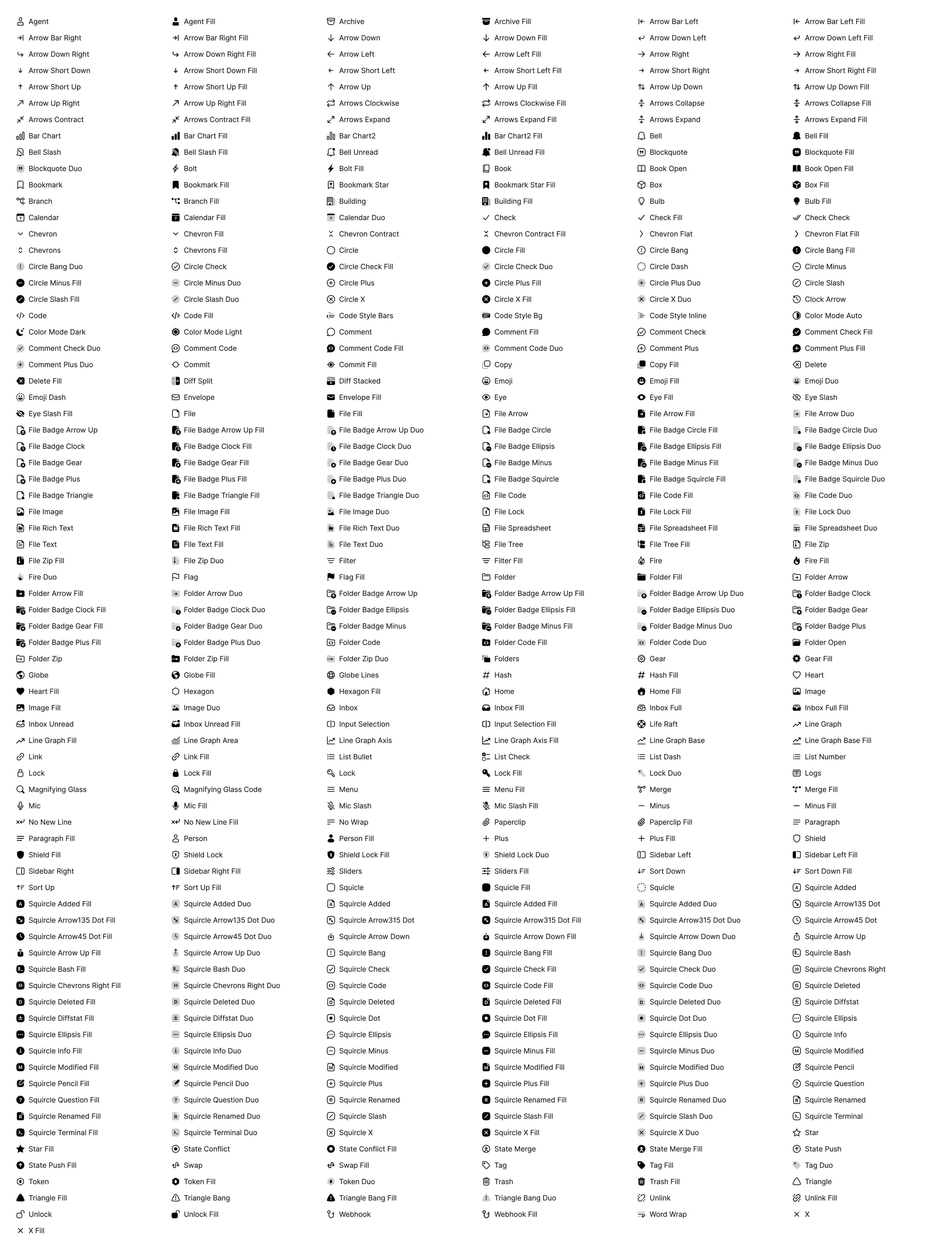
Honestly, very cool.
FIGMA TO REACT?
While the Figma composition came into focus, I had ambitions to do the same in React. And I was hoping I could go straight from Figma to React without any additional scripting or tooling after an export with a single Figma plugin. The thought came way before this icon redesign project when I prototyped the first SVGO exporter plugin. That gave me a great foundation to build on for what came next.
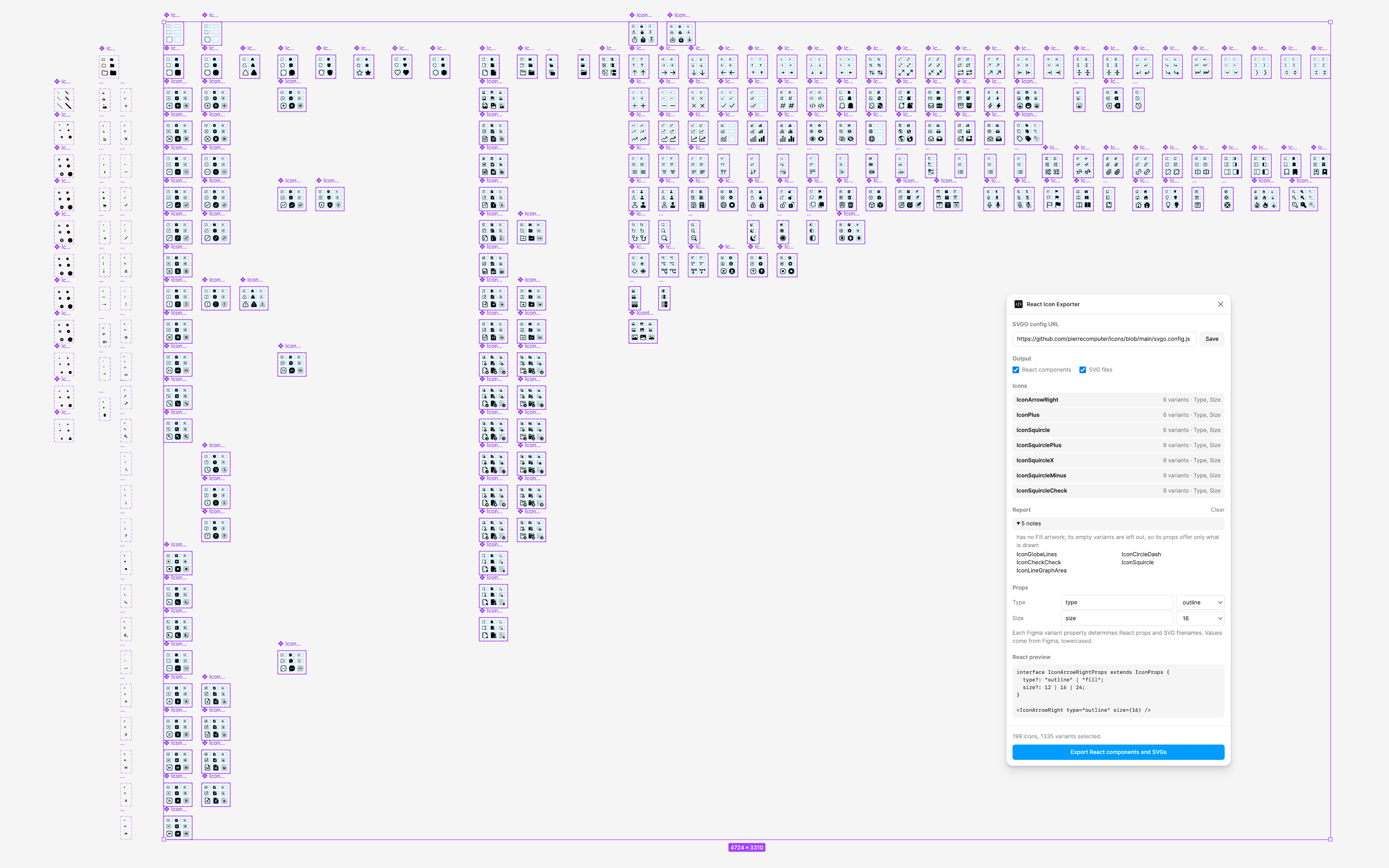
Enter the React Icon Exporter plugin. This reads a selected component set, identifies the variants within that component, and turns each Figma property into a React prop. Built on the original SVGO exporter plugin, it was a natural extension of that work.
Size=12/16/24becamesizeType=Outline/Fill/Duobecametype
Empty variants and variants containing only a layer named Placeholder were
skipped, which let a template set define the full matrix without pretending every icon
supported every combination.
A set such as IconFileCode produced a nearly 100-line component containing
all nine variants:
The exporter also did a surprising amount of geometry work:
- Outline strokes and flatten booleans on temporary copies.
- Preserve the original component frame as the SVG viewBox.
- Keep artwork drawn beyond that frame visible.
- Turn Figma layer names into stable CSS classes.
- Namespace SVG ids so masks from separate icon instances could not collide.
- Identify the translucent and opaque portions of duotone artwork.
- Write a report for missing, empty, duplicate, suspicious, or misaligned variants.
The plugin was working for the most part, but more complex icons were causing issues. The intersection of layers, masks, and badges caused it to introduce deviations in the final output.
EXPORTING BADGED ICONS
Badges? We don’t need no stinking badges.
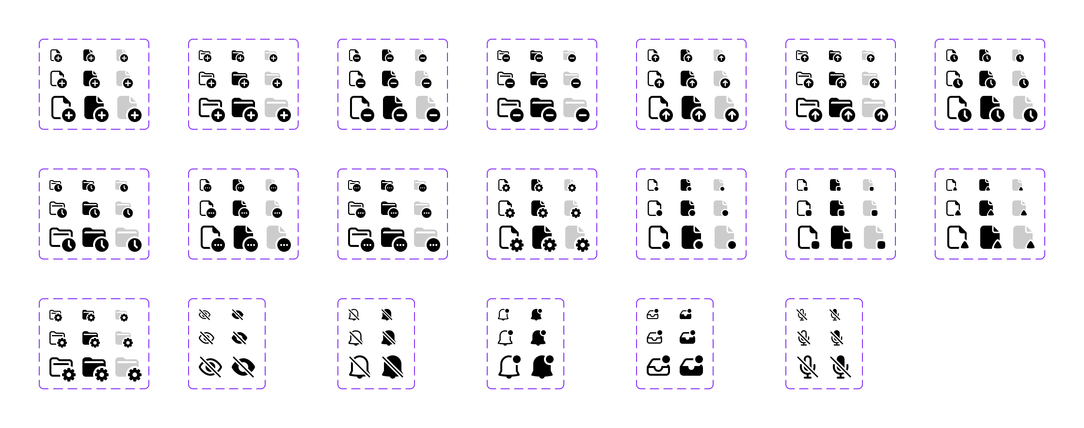
Part of adventure in attempting to export from Figma right to React was figuring out if I could translate the composition API. I already had a great SVGO-based exporter plugin to build on here so I started by trying to figure out how to composite the icons in React.
As mentioned earlier, badged icons are composed in Figma from three pieces: the base icon,
a knockout mask, and the badge itself. The end result would ideally look allow for calling
icons like <IconFileBadgeClock /> and
<IconFolderBadgeGearFill />.
<IconFile badge="clock" />
<IconFolder badge="gear" type="fill" />
Then, the component could have base layer, a native SVG mask, and a badge layer on top. The individual component would still exist, too. The source React component would look like this:
This all sounded so good in my head—honestly, I was extremely stoked at first—but once I started playing with it, things quickly fell apart.
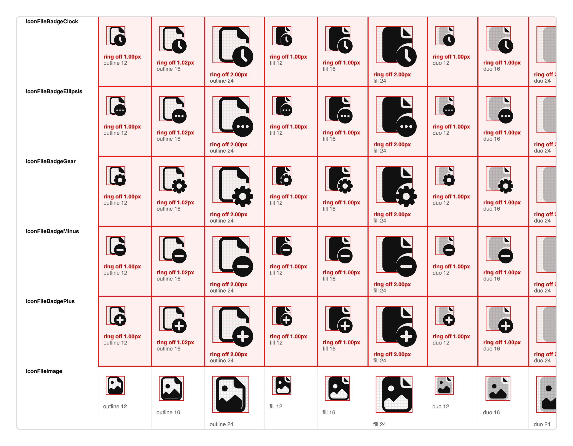
First, Figma’s geometry made runtime composition unreliable. Flattening booleans could
shift instances by a pixel, while artwork extending beyond a 16px frame could produce a
larger viewBox and shrink at size={16}. The fix required fixed viewBoxes,
native-size artwork, and visible overflow.
Second, composition also cost more. A file icon with one badge was 2.81KB gzip versus 1.40KB individually and a folder was 2.88KB versus 1.36KB. Multiplied by hundreds of icons, that difference is pretty meaty and ultimately made this approach non-viable. Composition would also likely affect tree-shaking, but I didn’t verify this.
So what did we learn in that brief but exciting detour?
-
Preserve a fixed viewBox and allow visible overflow on the individual
<svg>elements. - Ensure final artwork can be flattened during export by preserving boolean shapes at the source (e.g., don't flatten a union or subtract).
- Keep composition in Figma, where it helps drawing, without requiring the runtime API to mirror it.
Which is all to say, we’re back to individual icons and ensuring the exported SVGs remain the source of truth for React.
NEW ARCHITECTURE
SVG AS THE CONTRACT
The next iteration on the export-to-React pipeline was going back to where we started: Figma owns the visual truth, the repository owns all code processing and generation. SVGs become the exchange pipeline between the two.
So I had the LLMs update the SVGO Exporter plugin—which was originally created to export a selection of individual icons—to expand every drawn variant from the selected components and write a canonical SVG tree:
svg/
  IconComment/
    outline-12px.svg
    outline-16px.svg
    outline-24px.svg
    fill-12px.svg
    fill-16px.svg
    fill-24px.svg
  manifest.json
  REPORT.md
The manifest records component names, Figma property axes, defaults, variant properties, and file paths. Empty or placeholder variants are omitted. The SVGs already contain the flattened artwork, normalized paint, fixed component viewBox, visible overflow where needed, namespaced ids, and stable layer classes. We don’t run SVGO a second time locally this way.
Here’s the entry for IconArrowRight, trimmed to two of its six variants.
Figma’s Type and Size properties become the
type and size props, and every variant points at a file in the
SVG tree:
After export, we run npm run icons to generate:
- React components from the SVGs and manifest
- One SVG sprite symbol per icon variant
- The package export index
- The local HTML preview
It’s much less magical and not as automated as I originally hoped, but it’s more stable and more effective. The same canonical SVGs and manifest file can feed into generating sprites, more previews, and other future targets if we want at anytime.
THE CURRENT REACT API
The current API moved away from the original type prop idea. Instead, icon
style variants are separate exports:
import {
  IconFileBadgeGear,
  IconFileBadgeGearDuo,
  IconFileBadgeGearFill,
} from '@pierre/icons';

<IconFileBadgeGear size={12} />
<IconFileBadgeGearFill size={16} />
<IconFileBadgeGearDuo size={24} />
Each component’s size prop selects the actual 12, 16, or 24 drawing. It does
not scale a single SVG to all three sizes. Icons that don’t have a specific size drawing
only expose the sizes they contain, so the generated type can be as exact as
12 | 16 for accuracy.
While uncommon for us right now, this would need to evolve in the future if we wanted
sizes above 24px. I imagine we would add an additional prop that would extend the
available sizing options while allowing you to choose which source size to use for
scaling. For example, size={48}could default to scaling the 24px drawing, but
adding a sourceSize={16} prop could select the 16px drawing for a thinner
look.
Generated icon components also:
-
Accept standard SVG attributes such as
aria-*,data-*, event handlers, androle. -
Default to
currentColorwhile retaining Pierre’s named color mapping. -
Preserve an authored
overflow="visible"in both React components and sprite symbols. -
Use deterministic
.bgand.fgclasses for artwork the pipeline can classify safely. - Retain opacity from the SVG rather than inventing it at render time.
- Keep masks and referenced ids scoped to an icon instance where they still occur.
The .bg and .fg hooks began with duotone icons, where the
background shape is translucent while the foreground is opaque. We later applied the same
structural hooks to known-safe fill and outline icon variants, like file and folder badges
and layered icon decorations. Unknown or ambiguous SVGs are kept monochrome. This way, you
can make nearly any icon use custom colors beyond a singular fill.
By default, both layers inherit currentColor. Because the generated paths
carry classes, CSS can target them directly:
A wrapper could scope those rules, expose the colors as props or custom properties, and extend the same API across other icons.
PREVIEWS AS QA
Originally, I had a simple preview site locally that would render every icon and its filename. It wasn’t checked in, and wasn’t something I shared with folks other than screenshots of new icons from time to time. Throughout this process though, that preview quickly evolved to helping me verify API decisions, catch rendering issues, and see what needed refinement. It’s now more akin to a small, bespoke gallery app.
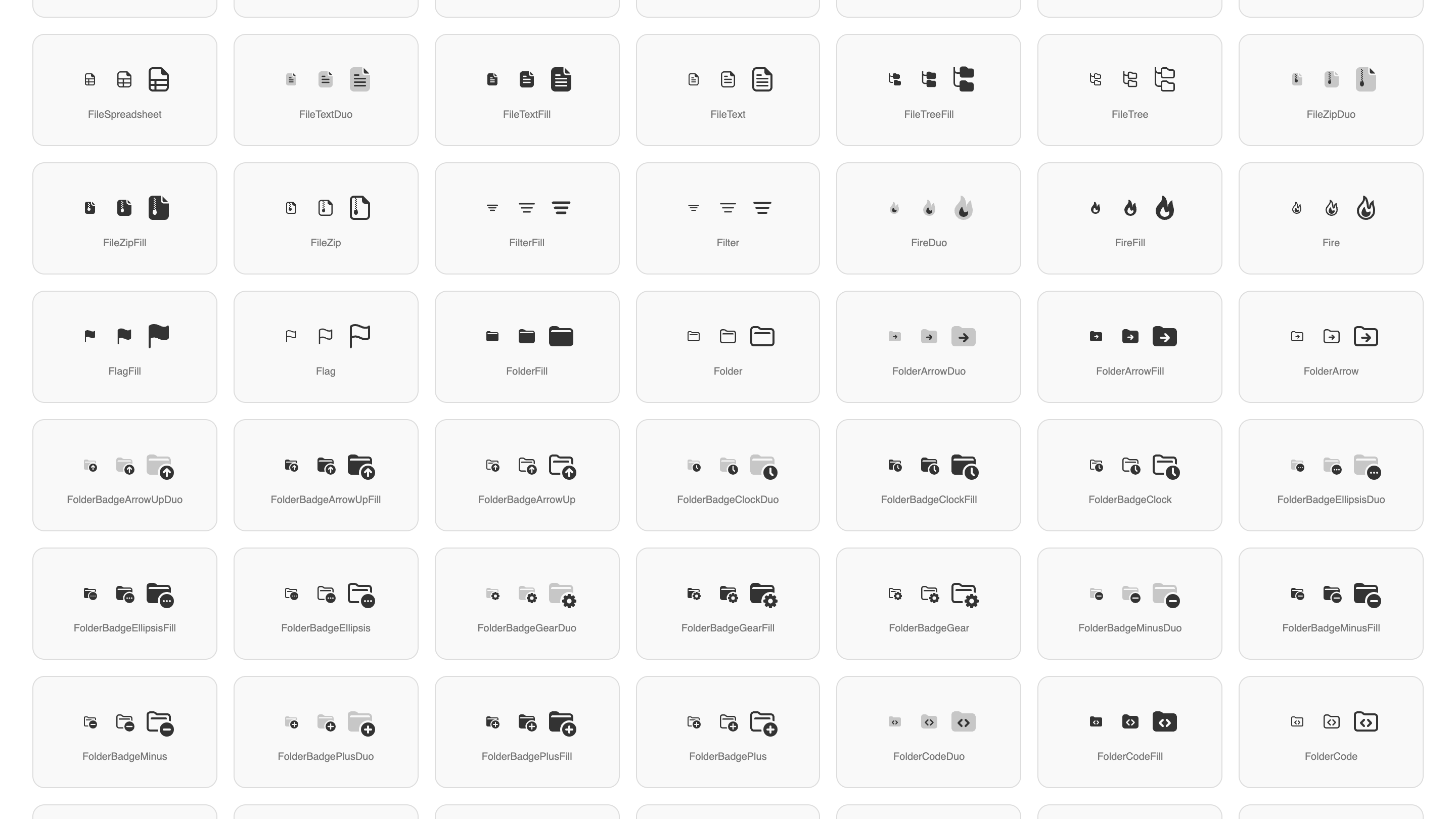
I also built an alternate preview with a more conventional catalog layout: categories, a browser, and a persistent inspector.
It can:
- Switch between the published collection and the in-progress redraw.
- Search by component name.
- Filter the new set by outline, fill, or duo.
- Render one size or show 12, 16, and 24 together.
- Switch from the gallery to a navigation list, where the same icons sit beside real labels at realistic spacing.
The list view matters because a mathematically centered icon can still feel too high, too heavy, or too detailed next to 13px text. Isolated icon grids hide those problems.
Clicking an icon opens a native browser popover. The left side contains a large live rendering and controls for its available styles. If the SVG has classified background and foreground layers, a Multi switch assigns them a pair of Pierre theme colors so separation problems are immediately obvious.
The bottom of that column shows the available React variants, usage snippets, and
generated props. The right side renders the actual generated React or canonical SVG source
through the @pierre/diffs File component, with syntax highlighting, wrapping,
and matching light and dark themes.
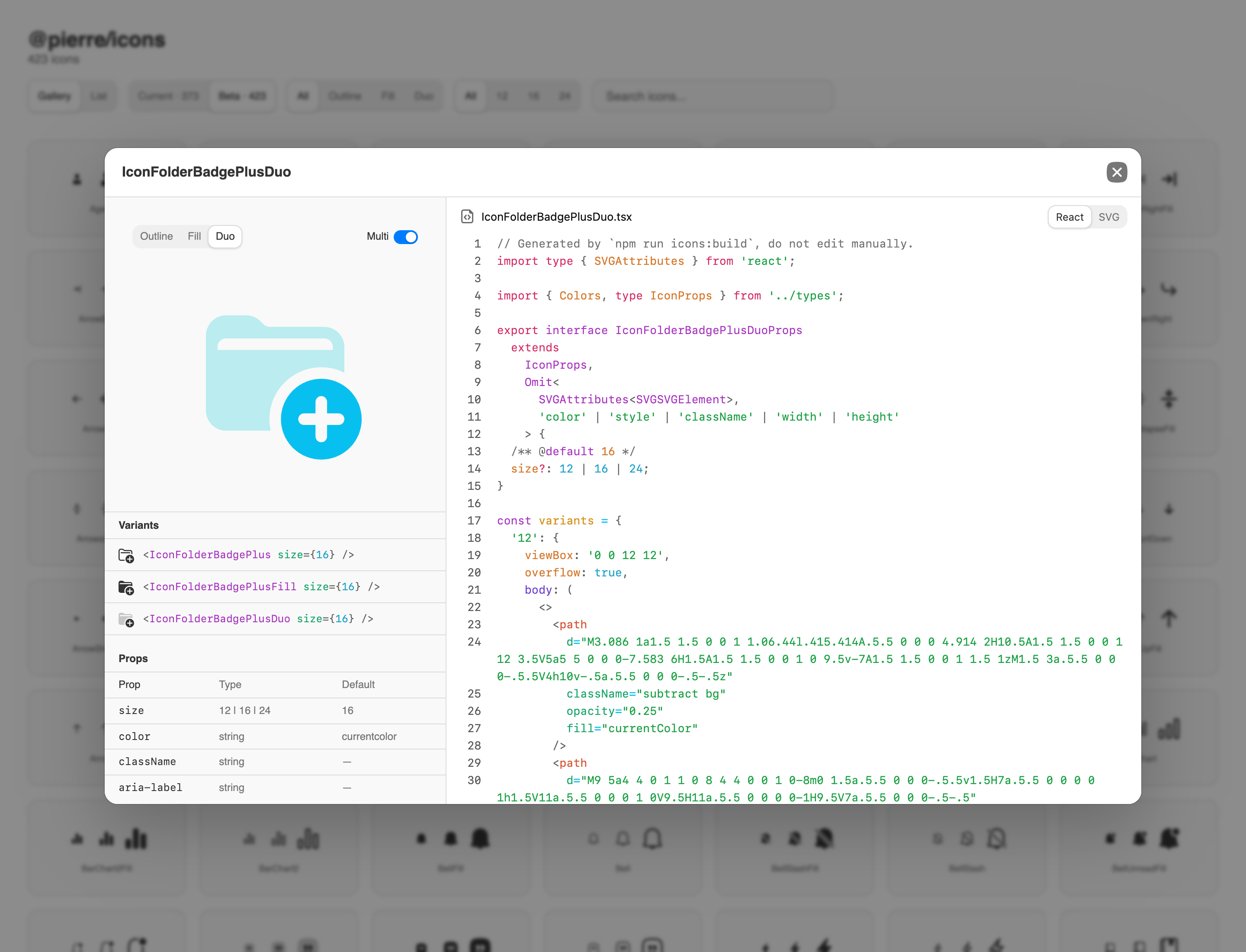
This is intentionally a generated static HTML file. It can be opened directly from
dist/index.html in Chrome, which keeps the feedback loop short and avoids
needing to run the product.
The preview has caught several classes of problem:
- A component frame changing the effective viewBox.
- Artwork clipping because overflow was lost.
- A missing size or style.
- Incorrect duotone opacity or layer assignment.
- A generated component name that did not match its SVG family.
- Source that rendered correctly but was unnecessarily complex.
- Icons that looked fine alone but wrong in a product-like row.
The preview isn’t the only check, though. Every export also writes a report before the generator ever runs. Each entry names the icon, the variant, and the Figma node ID, so fixing it starts with a search in Figma rather than in the generated code:
The report and preview complement each other. The exporter report catches structural invariants that can be measured. The browser catches what still needs to be seen.
THE NEW LOOP
The workflow now looks like this:
- Draw the 12, 16, and 24 variants in Figma.
- Use reusable layers and focused plugins to keep families aligned.
- Export canonical SVG variants and
manifest.jsonwith SVGO Exporter. -
Review
REPORT.mdfor missing artwork, duplicates, alignment issues, and other caveats. -
Replace the SVG tree in
@pierre/iconsand runnpm run icons. - Inspect the generated React, sprite, and preview output.
- Test icons both in isolation and in a product-like list.
- Fix the problem at the correct layer: drawing, export invariant, generator, or preview.
That final point is important. When the base file shifted, the answer wasn’t a CSS nudge in the React component. When multi-color duo artwork needed stable hooks, the answer wasn’t renaming hundreds of Figma layers by hand. The pipeline should preserve design intent and layer in code complexity only where it can be done deterministically.
LESSONS LEARNED
Phew, what a doozy of a journey and a blog post. Suffice to say, we ended up close to where we started, but with a much more refined approach with little to no sacrifices. Our final architecture is even simpler than any of the prototyped detours suggested, but it does exist because of that work.
- Direct Figma-to-React export proved that component properties could become exact TypeScript APIs, which looked amazing at first glance. However, it was not without issue.
- Runtime badge composition proved that masks and layers could remain semantic, then showed that individual flattened icons better fit our usage and bundle sizes.
- Debugging one-pixel shifts established fixed viewBoxes and visible overflow as non-negotiable invariants.
-
Multi-color experiments on Duo produced
.bgand.fghooks that are could be used in combination with all variants. - Prompting against live screenshots and generated source turned the preview from documentation into a viable test surface for both API and visual issues.
Now, every Pierre icon has a full paper trail from design to code, complete with layers of debugging and QA checks, more powerful functionality, and a much more customizable structure in each icon. While I didn’t get to do all the fun things I had hoped for at the beginning, I’m incredibly happy with the result. Onto designing the next wave of icons.
Have an interesting workflow for your icons? I'd love to hear about it. Holler at me on X/Twitter with a note.
<3